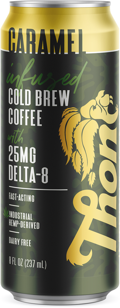
When thinking about my year-end blog, I knew I wanted to write about the past year’s biggest trends in packaging design. But one trend stood out far and above the rest, so it feels more intuitive to focus on just the one.
This trend came about as a response to ecommerce, which is why I don’t see it exiting any time soon. And now with COVID, people are shopping online even more so than before, making this trend a lasting one, at least for the time being.
What I’m referring to is big, bold, and simple design.

Think about it – when you’re scrolling Amazon (or your favorite retailer) on your phone, you’re looking at images that are about 1”x1”. At that size, you’re not going to see small details and romance copy. And with how cluttered our world already feels in terms of advertising, clear and concise rule.
But what does this mean for designers? Does this make packaging designers more obsolete, since design is getting simpler?
Quite the contrary, in my opinion. Just because packaging design is simpler, that doesn’t mean that designing it is. In fact, simple design can sometimes be more difficult. That’s because each element needs to be cleverly chosen, and with less elements telling the story of the brand, you have to choose those elements even more wisely.
I’m going to end with a few more designs that exemplify the big, bold, and simple design phenomenon. I look forward to seeing more of this trend in 2022!

Cover work done by OTRO Design

