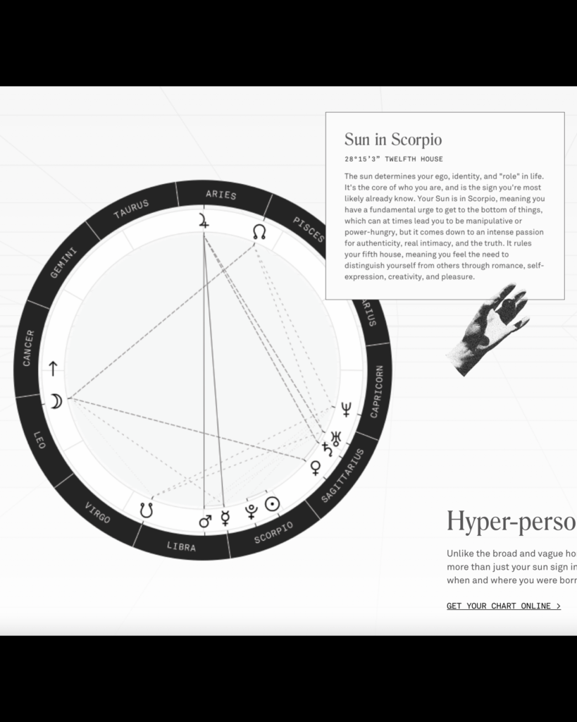
ASTROLOGY LESSON TIME: Let’s go back to late 2012 – remember when there was talk of the world ending on 12/21/12 because that date marked the end of the Mayan calendar? I realized recently that 12/21/12 had significance for another major reason – on this date, the Earth’s vernal equinox officially passed from Pisces into the Aquarius constellation, marking the “Age of Aquarius”.
Recently, there’s been a SIGNIFICANT rise in astrological interest. These days, knowing your birth horoscope (sun sign) is not enough – the average Gen Z-er can also recite their moon and rising sign, and [Surprise!], there is also a “sign” for each planet, further fueling our desire to understand ourselves and what makes us unique from one another.

Whether you’ve jumped on the astrology train or not, one thing is certain – it’s impact spreads further than the Co-Star app. Astrology has begun to influence graphic design in a big way.
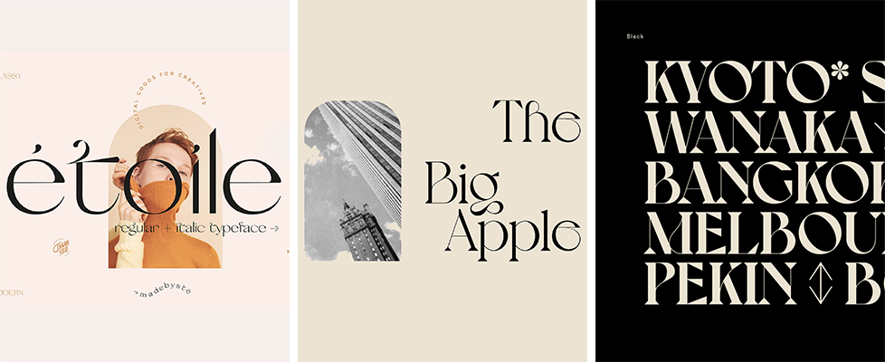
First and foremost are mystical fonts. Gone are the days of the traditional Garamond and Times New Roman. We’ve tossed those aside for more interesting serif fonts, such as Etoile and Voyage, that feature more dangerous curves and dramatic transitions in stroke weight, as if the characters were inked with a long-tipped calligraphy pen. These fonts have a mystical feel about them, like you’d expect to find them in an 1800’s-style apothecary shop, labeling potions and elixirs.

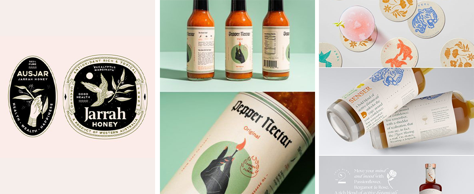
Take this graphic trend one step further, and you’ve got a defined packaging design style, accepted by:
- thin-lined, one-color illustrations of hands, suns, moons, botanicals, and animals
- use of arch-like shapes
- small tertiary text that’s utilized almost as a background texture or border
- intricate frames bordering the principal display panel, oftentimes with tiny detailing
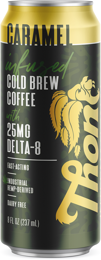
I’ve attached some of my favorite examples from the Packaging Inspo Style Category: Mystical. Find me on Pinterest for more clips of Mystical packaging designs! @goldsparkdesign


