(Yes, I wrote the title of this blog to sound like a Harry Potter Book.)
I spend hours of my week, perusing Pinterest. It’s my absolute favorite method of social media, and I’m not even being social (which says something about my personality). I glean much of my knowledge of trends by what I see on Pinterest. Lately, I’ve been especially taken by dramatic shadows, a micro-trend that I started noticing in mid-2019.
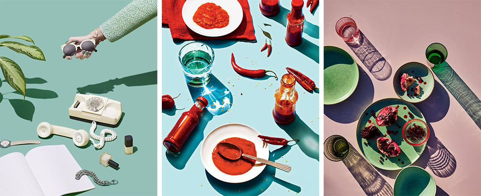
Back in 2019, this trend started with photography – objects artfully spread across a backdrop, with vivid colors and intense shadows at interesting angles. I’ve provided some examples below for your viewing pleasure.
Graphic design soon realized that Photography can’t have ALL the fun. Soon, this trend began bleeding into packaging design and its subsequent product mockup imagery.
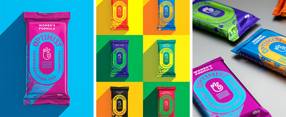
To be a designer these days, you need to be clever. This Optimist packaging, alone, is striking all by itself – the giant “O” logo; the “A-Okay” hand symbol as their “mark”; the curved type around the logo; using only two, bold colors; the stream coming off the “O” with the reversed pattern. But their product images are clever. Really clever. They’ve used the technique of a dramatic shadow, and made the shadow mirror the same position and angle as the shadow coming off of the “O” in the packaging. It’s shadow inception!
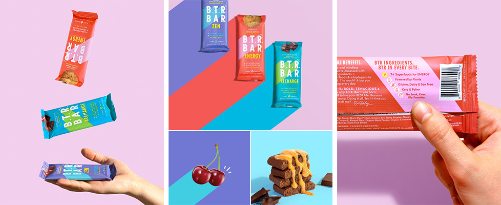
In B.T.R. Bar Brand’s product imagery, you see the same effect. They used a shadow in their design, coming off of the “B. T. R.”. And then they’ve mirrored that shadow in the product images. This shadow is designed to look unrealistic, as they’ve used the same background color in their packaging, as the color of the shadow. But the technique is the same. (And you can even see this shadow applied to the cherries in the bottom left.)
The Dramatic Shadow effect does a good job at conveying movement, which can be difficult for something as static as a vector image.
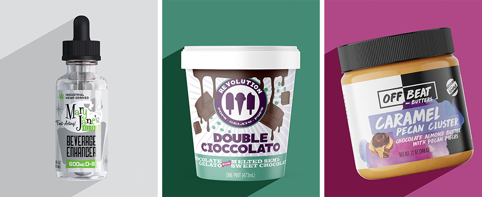
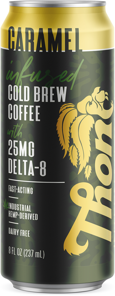
Last but not least, I decided last summer to use this technique in my own product mockup imagery for the portfolio on my website! I love how it provides a uniform look to all of my projects. The trick, though, is to balance uniformity with unexpectedness. Too much of a good thing is never good, so I sprinkled in some live photography as well.
Here are a few examples of how I used this technique in my own work. Enjoy!