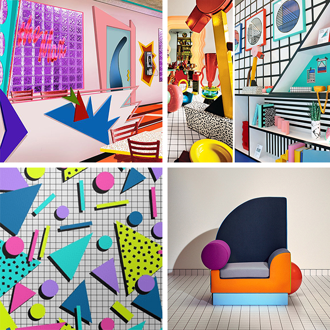
This geometric graphic trend hasn’t been this popular since Harry met Sally (literally). Grid backgrounds are EVERYWHERE right now – websites, packaging design, you name it. I even use a grid in the new branding I created last November. In my opinion, this checkered renaissance was left in the wake of the aftermath of an 80’s design style’s recent revival. What is this style, you ask? 80’s babies – think: Saved by the Bell. The goofy colors and geometric shapes from our favorite 90’s classic teen show actually have a name – it’s called Memphis Style.

The Memphis Group was an Italian architecture firm, famous for its postmodern furniture, carpets, lighting, and the like. The Milan-based group formed in 1980 as a conscious objection to modernism. Their style was clearly influenced by terrazzo (which I explain in a previous blog post), with similarities of haphazard shapes. But while terrazzo was more indicative of the imperfections of nature, Memphis Style was its bizarre, ephemeral cousin; born of asymmetrical triangles, circles, and bold primary colors. Not everyone was a raving fan.
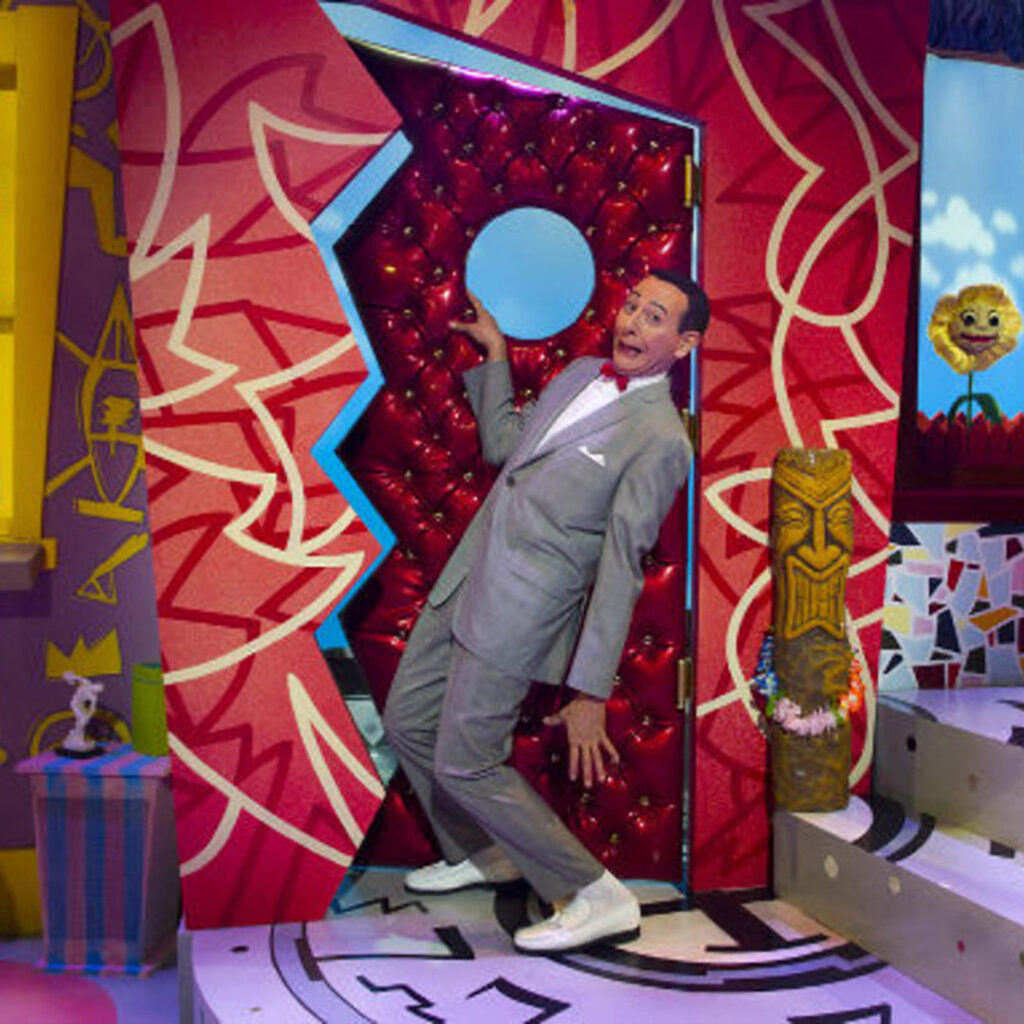
According to Brand Strategist, Bertrand Pellegrin, Memphis Style can be best described as “a shotgun wedding between Bauhaus and Fisher-Price.” Another trend researcher describes its colors as “Sesame Street”. And Pee-wee’s Playhouse.

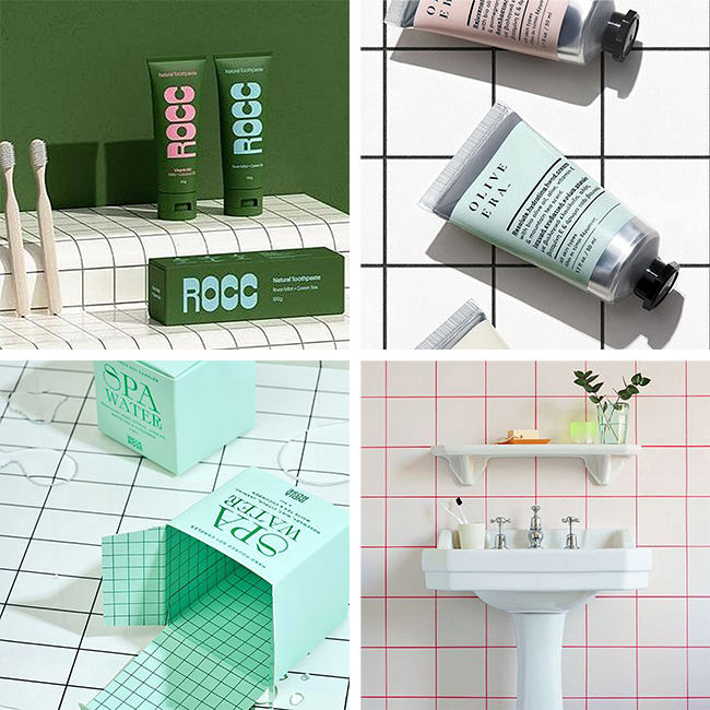
The Memphis Group disbanded in 1987, but they clearly left their mark. Saved by the Bell is my favorite example of Memphis Style in action; Pee-wee’s playhouse is another example. I’m unsure how the grid initially played into Memphis Style, but you can see it in almost every example I’ve posted – in the windows of The Max, as tilework beneath the kooky furniture, and in the background of the Memphis graphics. It makes sense; a checkered background provides some grounding And while the various, colorful shapes pair really nicely with the lightly screened grid background, both are strong enough to stand on their own. Here are a few modern examples of a grid background in action. Enjoy!


