Late last year, as I was soaking up the final season of Insecure, a micro-trend came to my attention: filled-in closed counter type. Let’s back up…
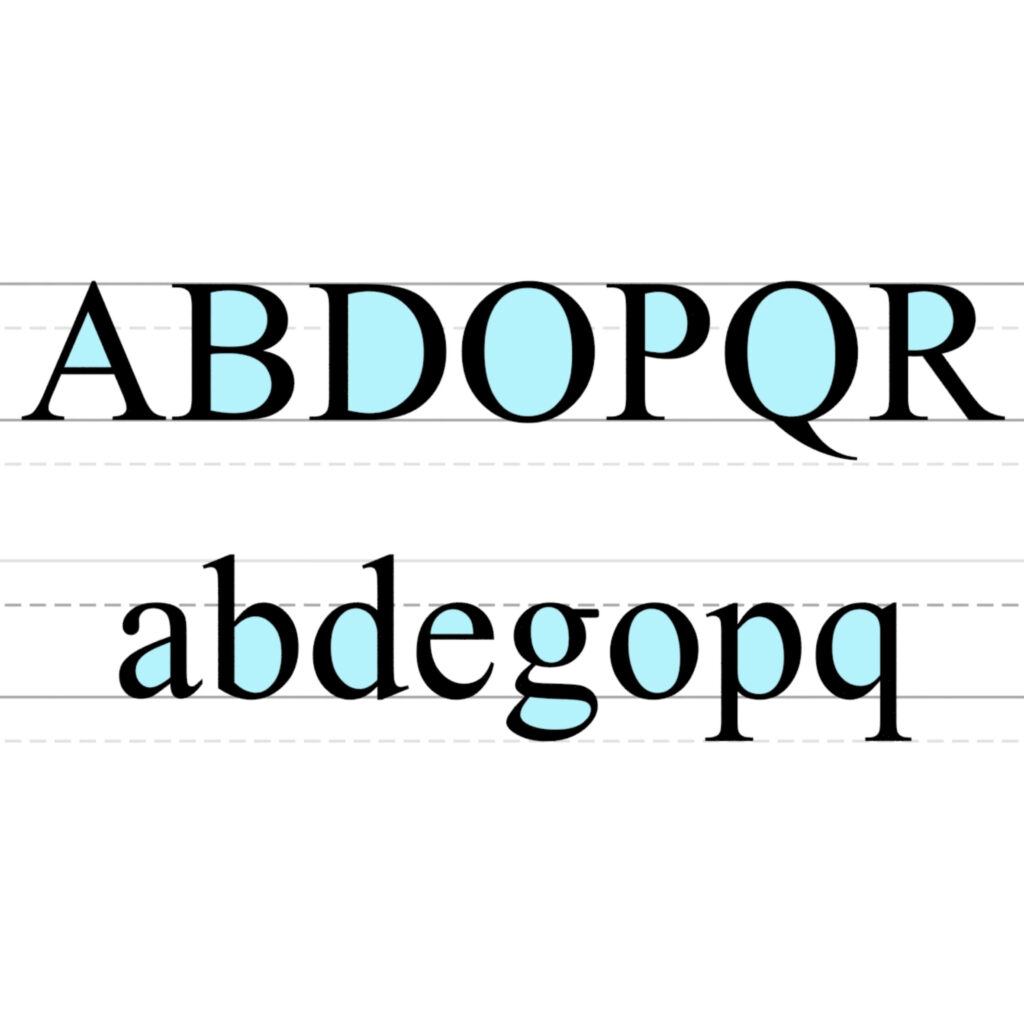
My letterform terminology is too rusty for a can of Coke, but after a bit of Googling, I came across the term “closed counters”. This is the space that is entirely enclosed by a letterform.

Letterforms containing closed counters include uppercased A, B, D, O, P, Q, R, lowercased a, b, d, e, g, o, p, and q, and the numbers 0, 4, 6, 8, and 9. Writing or printing these letterforms is no harder than writing or printing letterforms without closed counters. But when letters are cut out, like on signage, closed counter letters pose a problem, because until sign-making substrates have the ability to float in thin air, how do you display the negative space of the closed counter?
I know this is confusing, so I’ve attached two examples that showcase what I’m referring to.
Notice the line strip that connects the “P”, “0”, and “9” closed counters? Example from SteelandOakLLCShop on Etsy. In the second example, the La Proa sign was cleverly designed to account for attaching closed connecters.

Most sign-makers opt for a thin connecter that holds the closed counter negative space in place. But an even easier solution is to stylistically fill in that hole. It creates a graphic effect that’s so novel, it’s used in other applications where it isn’t necessary. Enter: Insecure.
The show Insecure by Issa Rae is incredible. I won’t go into the character development, script, acting, fashion, or interior design (which are ALL cutting edge). It’s the graphic design that’s most recently caught my attention. Here are different screengrabs from the series that showcase typography with filled-in closed counters.
I’m unsure if this is a worldwide trend or more specific to just this show, or HBO, but it almost certainly evolved from the sign-maker solution of filling in closed counters. Here are other recent examples of filled-in closed counters that have caught my attention. Enjoy!


